From an email list:

From an email list:

Valentine's Day MassacreAnd over 20 more -- excellent ideas and thoughts on web design.
by Our Gentle Readers
Roses are red, violets are blue, sometimes dear web, we sure hate you.
Daniel Aitken, web designer, proprietor
What angers me in today�s web, is the term �Web 2.0.� It�s the �2.0� specifically�the idea that the entire web is in for an upgrade, a change for the better to version two.
The web is not a singular application, it is a fluid interface. A means of information distribution, of functionality, of user-interoperability. It does not constrain to any idea of what an application is, because it is the combination of individual applications that make it so fluid. New coding techniques are constantly created, new hacks and workarounds for non-standards-compliant browsers. New ways of putting together existing code are being thought of and put into use every day somewhere on the millions of web pages the internet is home to. We aren�t yet on web 2.0, or internet 2.0, or computing 2.0. This is a dynamic change that will continue to happen whether or not we apply version numbers. The mass of netizens has triggered the implementation of web based applications, not a developer meeting that decided on the version change.
Jakob Nielsen is at it again. Here is his list of the: Top Ten Web Design Mistakes of 2005
For this year's list of worst design mistakes, I decided to try something new: I asked readers of my newsletter to nominate the usability problems they found the most irritating.
I assumed that asking for reader input would highlight many issues that I hadn't noticed in my own user testing. This was not the case. Instead, all of the top thirty problems were covered in existing usability guidelines. Thus, when you read this year's top ten list, you'll probably say, "Yes, I've heard about this before." That's okay.
There's value in reminding ourselves of past findings and raising their priority on the agenda of things to be fixed. Because these mistakes continue to be so common, it makes sense that people continue to complain about them the most.
And the list -- here are excerpts from the top three:
1. Legibility Problems
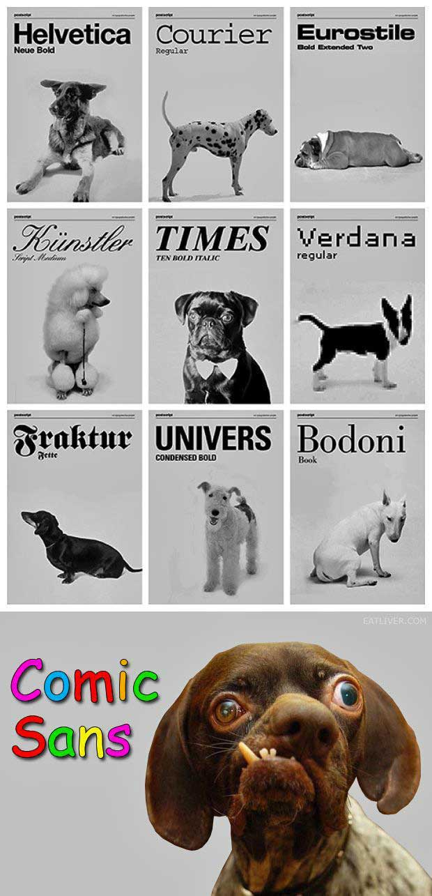
Bad fonts won the vote by a landslide, getting almost twice as many votes as the #2 mistake. About two-thirds of the voters complained about small font sizes or frozen font sizes; about one-third complained about low contrast between text and background.
2. Non-Standard Links
3. Flash
Design web pages? Check out OverLIB. From their website:
What is overLIB
overLIB is a JavaScript library created to enhance websites with small popup information boxes (like tooltips) to help visitors around your website. It can be used to provide the user with information about what will happen when they click on a link as well as navigational help (see the examples below). Not to mention that it looks cool, is stable, and has an active developer community to boot!
Downloaded the software and it looks pretty slick -- very low overhead and much better than other pop-ups built into the HTML spec. (I'm thinking specifically of the "acronym" tag which works but has no formatting options and is slow to display...)
Sometimes you see a website and like the colors being used but don't want to rip the design off, just use the same color combinations.
Point this tool at the site in question and it interrogates the HTML and CSS files and returns the colors used on that page.
Very spiffy!
| Design Element | Users Answering "Very Negatively" or "Negatively" |
|---|---|
| Pops-up in front of your window | 95% |
| Loads slowly | 94% |
| Tries to trick you into clicking on it | 94% |
| Does not have a "Close" button | 93% |
| Covers what you are trying to see | 93% |
| Doesn't say what it is for | 92% |
| Moves content around | 92% |
| Occupies most of the page | 90% |
| Blinks on and off | 87% |
| Floats across the screen | 79% |
| Automatically plays sound | 79% |
from Jakob Nielsen
Summary: There are ten usability mistakes that about two-thirds of corporate websites make. The prevalence of these errors alone warrants attention, especially since they appear on sites with significant investment in usable design.I typically focus my top-ten lists on issues that I think are the most important and most in need of attention. This time, I've used a different criterion: I've focused on the known usability principles that designers most frequently violate. Whether big or small, the very prevalence of these usability problems makes them worthy of attention.The frequency statistics are based on the numerous homepage reviews that my company has performed since I published my book on homepage usability. This data source introduces a bias, because only big companies or government agencies with a substantial usability commitment will invest $10,000 to have an independent expert assess its homepage design. However, we can turn that bug into a feature: if companies with a demonstrated commitment to usability make certain mistakes, they must be particularly slippery pitfalls.
For each of the ten most frequent mistakes, I state the deplorably low percentage of homepages that follow the guideline. I've sorted the list by compliance rate: number one is the guideline that the fewest sites follow (that is, the mistake that's made most often).
Excellent article from Digital Web Magazine regarding Cascading Style Sheets and why the current trend to do clever hacks with them is a Bad Thing...
Daily Sucker for Wednesday, October 29, 2003
America's Web Site brings you another site that deals with dogs.
I'm at a grantwriting conference all day today, so here's a really simple example where almost everything is wrong and it keeps up yesterday's theme of dogs. Here's the e-mail:
I'm sure my animal rights activist daughter won't get a chuckle out of the chimps and monkeys page or too many of the other pages.
I teach a film studies course at a high school in Massachusetts. I was trying to find some sources for one of my students who is interested in animal actors and animal training, and I found this:
It has been a while since I read your excellent book Web Pages That Suck, but I remember enough to know that you might get a chuckle out of this website.
Post to MovableType or Typepad from FeedDemon
In the FeedDemon newsgroup Jakub Kazecki shared how to post to MovableType directly from FeedDemon RSS Reader, as shown below. See also Glenn Slaven's post for posting to Typepad from FeedDemon. FeedDemon 1.0 RC2 is also now available. See today's post for links and details. (168 words, 8 links)
World Domination for Small Web Businesses
You want to own the global Web development market? Ditch that inclusive marketing approach and narrow your focus to self-contained segments. Andrew presents the theory and practice of niche marketing, arguing that it's easy to be a big (and prosperous) fish when the pond is small.