Good bit of research at deadprogrammer's caf� tracing the evolution of a well known corporate logo from its origins, the 'naughty' one and the sanitized one. Talking about the Starbucks Siren:
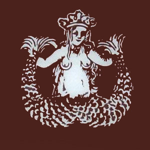
How the Starbucks Siren Became Less NaughtyAn excellent post on how they went from here:
Corporate logos often have elements that most people don�t know about. For instance the arrow in the Fedex logo that was covered in depth on The Sneeze. This arrow made me think a little about the Starbucks logo.
As and introduction to this bit of research let me present a short quote from the cult cartoon show Futurama (episode [2ACV12] "The Deep South") in which one of the characters, Fry, tries to engage in "maritals" with a mutant mermaid:"Umbriel: What the hell is that?
Fry: Yeah I�m a little confused too. How do I� y�now�with the tail and all.
Umbriel: I�m not your first am I? I mean, I lay my eggs and leave and you release your fertiliser.
[Scene: Outside Colonel�s House. Fry runs away from the house at top speed.]
Fry (gasping): Why couldn�t she be the other type of mermaid, with the fish part on top and the lady part on the bottom?"
So they reduced the size of their logo; now how about they reduce the price of their coffee (and other stuff as well)...