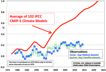
Here is a graph of Earth's temperatures from 1975 through 2025
The circles and squares are observed temperatures - circles are the average of four different sets of balloon data and the squares are the average of two seats of satellite data.
The big red line is the average of 102 IPCC climate models.
See the problem?
This graph is from Dr. John Christy - here is a bit of his bio from the University of Alabama website:
About John
Dr. John R. Christy is the Distinguished Professor of Atmospheric Science and Director of the Earth System Science Center at the University of Alabama in Huntsville where he began studying global climate issues in 1987. Since November 2000 he has been Alabama's State Climatologist.
The New York Times had a nice writeup of him last year: Though Scorned by Colleagues, a Climate-Change Skeptic Is Unbowed
The truth is out there...

Leave a comment